R語言條形圖
條形圖表示矩形條中的資料,其長度與變數的值成比例。R使用barplot()函式來建立條形圖。R可以在條形圖中繪製垂直和水平條。 在條形圖中,每個條可以被賦予不同的顏色。
語法
在R中建立條形圖的基本語法是 -
barplot(H, xlab, ylab, main, names.arg, col)
以下是使用的引數的描述 -
- H - 是包含條形圖中使用的數值的向量或矩陣。
- xlab - 是
x軸的標籤。 - ylab - 是
y軸的標籤。 - main - 是條形圖的標題。
- names.arg - 是在每個欄下顯示的名稱向量。
- col - 用於給圖中的圖條給出顏色。
範例
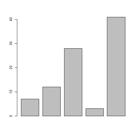
使用輸入向量和每個欄的名稱建立一個簡單的條形圖。以下指令碼將在當前R工作目錄中建立並儲存條形圖。
setwd("F:/worksp/R")
# Create the data for the chart.
H <- c(7,12,28,3,41)

# Give the chart file a name.
png(file = "barchart.png")

# Plot the bar chart.
barplot(H)

# Save the file.
dev.off()
當我們執行上述程式碼時,會產生以下結果 -
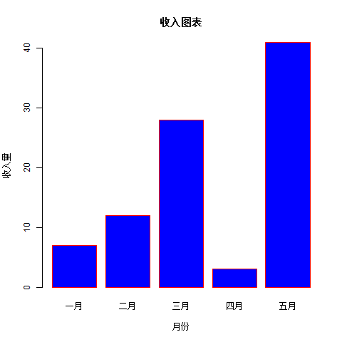
條形圖示籤,標題和顏色
可以通過新增更多引數來擴充套件條形圖的功能。main引數用於新增標題。 col引數用於向條新增顏色。 args.name是與輸入向量相同數量的值的向量,用於描述每個欄的含義。
範例
以下指令碼將在當前R工作目錄中建立並儲存條形圖片,如下所示 -
setwd("F:/worksp/R")
# Create the data for the chart.
H <- c(7,12,28,3,41)
M <- c("一月","二月","三月","四月","五月")

# Give the chart file a name.
png(file = "barchart_months_revenue.png")

# Plot the bar chart.
barplot(H,names.arg = M,xlab = "月份",ylab = "收入量",col = "blue",
main = "收入圖表",border = "red")

# Save the file.
dev.off()
當我們執行上述程式碼時,會產生以下結果 -
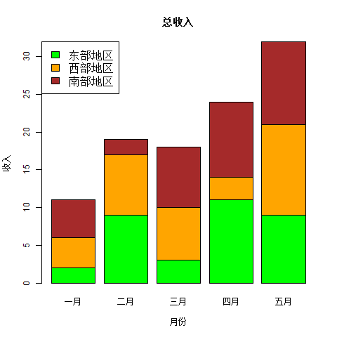
組條形圖和堆疊條形圖
我們可以通過使用矩陣作為輸入值,在每個欄中建立條形圖和條形圖。多於兩個變數表示為用於建立組條形圖和堆疊條形圖的矩陣。
setwd("F:/worksp/R")
# Create the input vectors.
colors <- c("green","orange","brown")
months <- c("一月","二月","三月","四月","五月")
regions <- c("東部地區","西部地區","南部地區")

# Create the matrix of the values.
Values <- matrix(c(2,9,3,11,9,4,8,7,3,12,5,2,8,10,11),nrow = 3,ncol = 5,byrow = TRUE)

# Give the chart file a name.
png(file = "barchart_stacked.png")

# Create the bar chart.
barplot(Values,main = "總收入",names.arg = months,xlab = "月份",ylab = "收入",
   col = colors)

# Add the legend to the chart.
legend("topleft", regions, cex = 1.3, fill = colors)

# Save the file.
dev.off()
當我們執行上述程式碼時,會產生以下結果 -