python爬蟲天貓商品數據及分析(2)
2020-08-08 14:10:42
目的
對之前所獲取的數據源進行數據分析操作
數據分析
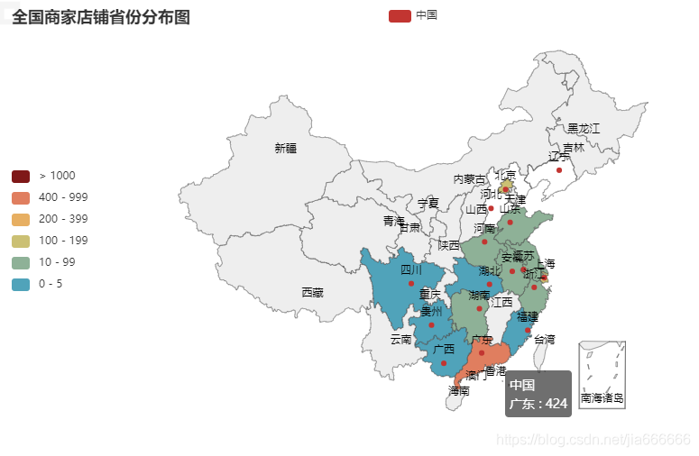
一:商家地區分佈圖
通過讀取本地數據源,獲取其中省份的相關資訊,繪製商家地區分佈圖,以html格式儲存在本地,
瀏覽器開啓可隨滑鼠移動動態顯示地區分佈商家數量
#!/usr/bin/env python
# -*- coding: utf-8 -*-
"""
__title__ = ''
__author__ = 'jia666666'
"""

from pyecharts.charts import Map
import pyecharts.options as opts


import time
import pandas as pd


# 讀取數據
n = '../file/CSV/智慧手機'  + '-all.csv'
#n = time.strftime("%Y-%m-%d") + "bak.CSV"
data = pd.read_csv(n)

total_data = {}
for item in data['省份']:
    #print(item)
    if item not in total_data:
        #向字典中更新每個省份預設0病例
        total_data.update({item:1})
    else:
        total_data[item]+=1

province=total_data.keys()
num=total_data.values()

list_data=zip(province,num)


#-------------------------------------------------------------------------------------
# 第二步:繪製全國商家地圖
#-------------------------------------------------------------------------------------
def map_cn_disease_dis() -> Map:
    c = (
        Map()
        .add('中國', list_data, 'china')
        .set_global_opts(
            title_opts=opts.TitleOpts(title='全國商家店鋪省份分佈圖'),
            visualmap_opts=opts.VisualMapOpts(is_show=True,
                                              split_number=6,
                                              is_piecewise=True,  # 是否爲分段型
                                              pos_top='center',
                                              pieces=[
                                                   {'min': 1000, 'color': '#7f1818'},  #不指定 max
                                                   {'min': 400, 'max': 999},
                                                   {'min': 200, 'max': 399},
                                                   {'min': 100, 'max': 199},
                                                   {'min': 10, 'max': 99},
                                                   {'min': 0, 'max': 5} ],
                                              ),
        )
    )
    return c
#儲存html檔案
map_cn_disease_dis().render('../file/HTML/全國商家省份分佈圖.html')
print('檔案儲存完成')
結果顯示
二 商品名稱詞雲圖
#!/usr/bin/env python
# -*- coding: utf-8 -*-

import time
import pandas as pd


#----------------------------------------------讀取數據----------------------------------------------
# 讀取數據
n = '../file/CSV/智慧手機'  + '-all.csv'
#n = time.strftime("%Y-%m-%d") + "bak.CSV"
data = pd.read_csv(n)

#檢視數據維度(行,列)
#print(data.shape)

#取出商品標題,區域,價格,銷售四個維度的數據
#data=data[['商品名','價格','銷售','省份']]


#對每個標題進行分詞,使用jieba分詞

#----------------------------------------------s商品名稱分詞處理----------------------------------------------
import jieba

title=data['商品名']

title_s=[]
#商品名分詞
for line in title:
    title_cut=jieba.lcut(line)
    for i in title_cut:
        title_s.append(i)
#print(title_s)


# 匯入停用此表
stopwords = [line.strip() for line in open('../file/TXT/StopWords.txt', 'r', encoding='utf-8').readlines()]
#print(stopwords)

# 剔除停用詞
title_clean = []
for line in title_s:
        if line not in stopwords:
            title_clean.append(line)
#print(title_clean)


# 把列表 allwords_clean_dist 轉爲數據框
df_allwords_clean_dist = pd.DataFrame({
    'allwords': title_clean
})

#print(df_allwords_clean_dist)
#
# # 對過濾_去重的詞語 進行分類彙總
word_count = df_allwords_clean_dist.allwords.value_counts().reset_index()
word_count.columns = ['word', 'count']
#x[0]: x[1] for x in word_count.head(100).values


#----------------------------------------------詞雲視覺化----------------------------------------------

from wordcloud import WordCloud
import matplotlib.pyplot as plt
import imageio as im
#尺寸大小
plt.figure(figsize=(8, 8))

# 讀取圖片,用於限制大小
pic = im.imread("../file/PNG/貓.PNG")
#print(pic)
w_c = WordCloud(font_path="simhei.ttf", background_color="black",mask=pic,max_font_size=100, margin=1)
wc = w_c.fit_words({
    x[0]: x[1] for x in word_count.head(100).values
})

#顯示詞雲
plt.imshow(wc, interpolation='bilinear')
#座標刻度隱藏
plt.axis("off")
plt.show()

# 儲存到檔案
wc.to_file('../file/PNG/01商品名稱詞雲.PNG')
結果展示

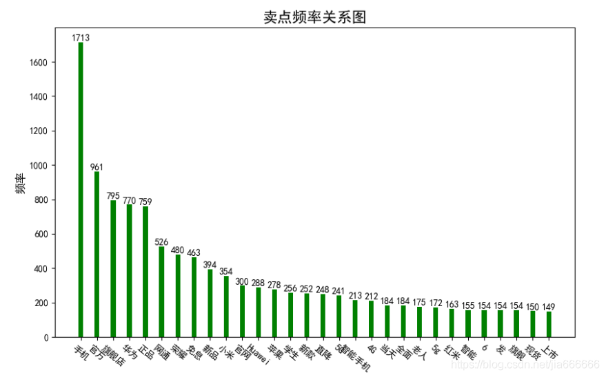
三 賣點頻率關係圖
#!/usr/bin/env python
# -*- coding: utf-8 -*-
"""
__title__ = ''
__author__ = 'jia666666'
__time__ = '2020/3/24'
"""
import time
import pandas as pd


#----------------------------------------------讀取數據----------------------------------------------
# 讀取數據
#n = time.strftime("%Y-%m-%d") + "bak.CSV"
n = '../file/CSV/智慧手機'  + '-all.csv'
data = pd.read_csv(n)
data_sales=data['銷量']
#檢視數據維度(行,列)
#print(data.shape)

#取出商品標題,區域,價格,銷售四個維度的數據
#data=data[['商品名','價格','銷售','省份']]


#對每個標題進行分詞,使用jieba分詞

#----------------------------------------------s商品名稱分詞處理----------------------------------------------
import jieba

title=data['商品名']

title_s=[]
#商品名分詞
for line in title:
    title_cut=jieba.lcut(line)
    for i in title_cut:
        title_s.append(i)
#print(title_s)


# 匯入停用此表
stopwords = [line.strip() for line in open('../file/TXT/StopWords.txt', 'r', encoding='utf-8').readlines()]
#print(stopwords)

# 剔除停用詞
title_clean = []
for line in title_s:
        if line not in stopwords:
            title_clean.append(line)
#print(title_clean)


# 把列表 allwords_clean_dist 轉爲數據框
df_allwords_clean_dist = pd.DataFrame({
    'allwords': title_clean
})

#print(df_allwords_clean_dist)
#
# # 對過濾_去重的詞語 進行分類彙總
word_count = df_allwords_clean_dist.allwords.value_counts().reset_index()
word_count.columns = ['word', 'count']
#print(word_count)


#------------------------------------------------------------------------------
# 第二步:繪製柱狀圖
#------------------------------------------------------------------------------
import matplotlib.pyplot as plt
import numpy as np

plt.rcParams['font.sans-serif'] = ['SimHei']  #用來正常顯示中文標籤
plt.rcParams['axes.unicode_minus'] = False    #用來正常顯示負號

#獲取數據

nume,sales=[],[]
for shopname,shopsales in word_count.head(30).values:
    nume.append(shopname)
    sales.append(shopsales)
# names = total_data.keys()
# # nums = total_data.values()
# # print(names)
# # print(nums)

# 繪圖
plt.figure(figsize=[10,6])
#plt.bar(names, nums, width=0.3, color='green')
plt.bar(nume,sales, width=0.3, color='green')

# 設定標題
plt.xlabel("賣點", fontproperties='SimHei', size=12)
plt.ylabel("頻率", fontproperties='SimHei', rotation=90, size=12)
plt.title("賣點頻率關係圖", fontproperties='SimHei', size=16)
#傾斜度角
plt.xticks(list(nume), fontproperties='SimHei', rotation=-40, size=10)
# 顯示數位
for a, b in zip(list(nume), list(sales)):
    #x軸,y軸,顯示數值,水平居中,垂直底部,字型大小
    plt.text(a,b,b, ha='center', va='bottom', size=10)

#儲存並顯示
plt.savefig('../file/PNG/02賣點頻率關係圖.png')
plt.show()
結果展示
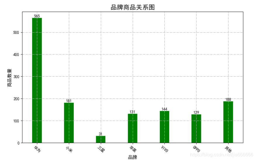
四 品牌商品關係圖
#!/usr/bin/env python
# -*- coding: utf-8 -*-
"""
__title__ = ''
__author__ = 'jia666666'

"""
import time
import pandas as pd
import matplotlib.pyplot as plt

# 讀取數據
n = '../file/CSV/智慧手機'  + '-all.csv'
data = pd.read_csv(n)

huawei,xioami,sanxing,apple,vivo,oppo,other=0,0,0,0,0,0,0
for item in data['商品名']:
    #print(item)
    if '華爲' in item:
        huawei+=1
    elif '小米' in item:
        xioami+=1
    elif '三星' in item:
        sanxing+=1
    elif '蘋果' in item:
        apple+=1
    elif 'vivo' in item:
        vivo+=1
    elif 'oppo' in item:
        oppo+=1
    else:
        other+=1

import matplotlib.pyplot as plt
import numpy as np

plt.rcParams['font.sans-serif'] = ['SimHei']  #用來正常顯示中文標籤
plt.rcParams['axes.unicode_minus'] = False    #用來正常顯示負號

#獲取數據

names = ['華爲','小米','三星','蘋果','VIVO','OPPO','其他']
nums = [huawei,xioami,sanxing,apple,vivo,oppo,other]


# 繪圖
plt.figure(figsize=[10,6])
#plt.bar(names, nums, width=0.3, color='green')
plt.bar(names,nums, width=0.3, color='green')

# 設定標題
plt.xlabel("品牌", fontproperties='SimHei', size=12)
plt.ylabel("商品數量", fontproperties='SimHei', rotation=90, size=12)
plt.title("品牌商品關係圖", fontproperties='SimHei', size=16)
#傾斜度角
plt.xticks(list(names), fontproperties='SimHei', rotation=-40, size=10)
# 顯示數位
for a, b in zip(list(names), list(nums)):
    #x軸,y軸,顯示數值,水平居中,垂直底部,字型大小
    plt.text(a,b,b, ha='center', va='bottom', size=10)
plt.grid(linestyle='-.')
plt.savefig('../file/PNG/08品牌商品關係圖.png')
plt.show()
結果展示
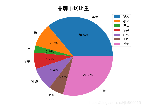
五 品牌市場佔比
import time
import pandas as pd
import matplotlib.pyplot as plt

# 讀取數據
n = '../file/CSV/智慧手機'  + '-all.csv'
data = pd.read_csv(n)

huawei,xioami,sanxing,apple,vivo,oppo,other=0,0,0,0,0,0,0
for item in data['商品名']:
    #print(item)
    if '華爲' in item:
        huawei+=1
    elif '小米' in item:
        xioami+=1
    elif '三星' in item:
        sanxing+=1
    elif '蘋果' in item:
        apple+=1
    elif 'vivo' in item:
        vivo+=1
    elif 'oppo' in item:
        oppo+=1
    else:
        other+=1
#獲取數據

names = ['華爲','小米','三星','蘋果','VIVO','OPPO','其他']
nums = [huawei,xioami,sanxing,apple,vivo,oppo,other]
goods_sum=len(data['商品名'])

import matplotlib.pyplot as plt
import numpy as np

plt.rcParams['font.sans-serif'] = ['SimHei']  #用來正常顯示中文標籤
plt.rcParams['axes.unicode_minus'] = False    #用來正常顯示負號


plt.pie(nums,labels=names,autopct='%.2f%%')
plt.title("品牌市場比重", fontproperties='SimHei', size=16)
plt.axis('equal')
plt.legend()

plt.savefig('../file/PNG/09品牌市場比重.png')
plt.show()
結果展示
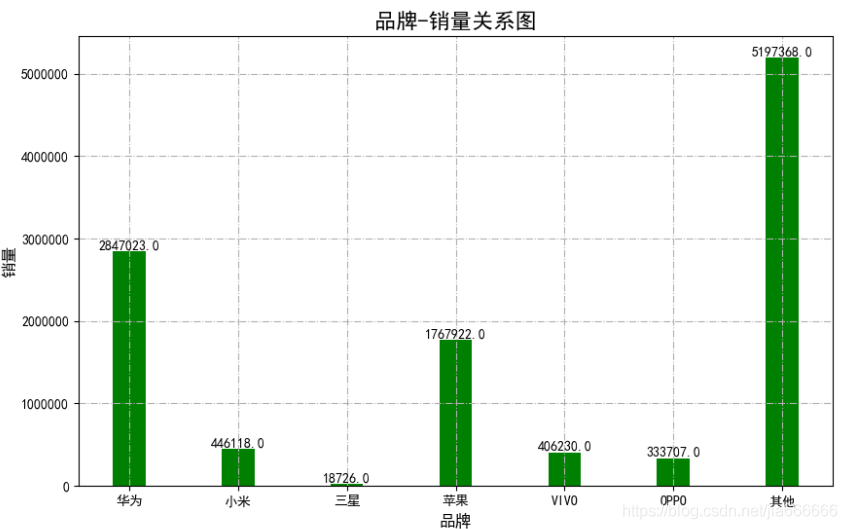
六 品牌銷量關係圖
#!/usr/bin/env python
# -*- coding: utf-8 -*-
"""
__title__ = ''
__author__ = 'jia666666'
__time__ = '2020/3/24'
"""
import time
import pandas as pd


# 讀取數據
n = '../file/CSV/智慧手機'  + '-all.csv'
data = pd.read_csv(n)
data.fillna(value=0,inplace=True)


huawei,xioami,sanxing,apple,vivo,oppo,other=0,0,0,0,0,0,0
for item,num in zip(data['商品名'],data['銷量']):
    if '華爲' in item:
        huawei+=num
    elif '小米' in item:
        xioami+=num
    elif '三星' in item:
        sanxing+=num
    elif '蘋果' in item:
        apple+=num
    elif 'vivo' in item:
        vivo+=num
    elif 'oppo' in item:
        oppo+=num
    else:
        #print(item)
        other+=num


#------------------------------------------------------------------------------
# 第二步:繪製柱狀圖
#------------------------------------------------------------------------------
import matplotlib.pyplot as plt
import numpy as np

plt.rcParams['font.sans-serif'] = ['SimHei']  #用來正常顯示中文標籤
plt.rcParams['axes.unicode_minus'] = False    #用來正常顯示負號

#獲取數據

names = ['華爲','小米','三星','蘋果','VIVO','OPPO','其他']
nums = [huawei,xioami,sanxing,apple,vivo,oppo,other]


# 繪圖
plt.figure(figsize=[10,6])
#plt.bar(names, nums, width=0.3, color='green')
plt.bar(names,nums, width=0.3, color='green')

# 設定標題
plt.xlabel("品牌", fontproperties='SimHei', size=12)
plt.ylabel("銷量", fontproperties='SimHei', rotation=90, size=12)
plt.title("品牌-銷量關係圖", fontproperties='SimHei', size=16)
#傾斜度角
plt.xticks(list(names), fontproperties='SimHei', rotation=-0, size=10)
# 顯示數位
for a, b in zip(list(names), list(nums)):
    #x軸,y軸,顯示數值,水平居中,垂直底部,字型大小
    plt.text(a,b,b, ha='center', va='bottom', size=10)

plt.grid(linestyle='-.')
plt.savefig('../file/PNG/10品牌銷量關係圖.png')
plt.show()
結果展示
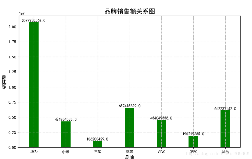
七 品牌銷售額對比
#!/usr/bin/env python
# -*- coding: utf-8 -*-
"""
__title__ = ''
__author__ = 'jia666666'
__time__ = '2020/3/24'
"""
import time
import pandas as pd
import matplotlib.pyplot as plt

# 讀取數據
n = '../file/CSV/智慧手機'  + '-all.csv'
data = pd.read_csv(n)
data.fillna(value=0,inplace=True)

huawei,xioami,sanxing,apple,vivo,oppo,other=0,0,0,0,0,0,0
for item,price,num in zip(data['商品名'],data['價格'],data['銷量']):
    #print(item,price)
    price=int(price)
    if '華爲' in item:
        huawei+=price*num
    elif '小米' in item:
        xioami+=price*num
    elif '三星' in item:
        sanxing+=price*num
    elif '蘋果' in item:
        apple+=price*num
    elif 'vivo' in item:
        vivo+=price*num
    elif 'oppo' in item:
        oppo+=price*num
    else:
        other+=price*num


#------------------------------------------------------------------------------
# 第二步:繪製柱狀圖
#------------------------------------------------------------------------------
import matplotlib.pyplot as plt
import numpy as np

plt.rcParams['font.sans-serif'] = ['SimHei']  #用來正常顯示中文標籤
plt.rcParams['axes.unicode_minus'] = False    #用來正常顯示負號

#獲取數據

names = ['華爲','小米','三星','蘋果','VIVO','OPPO','其他']
nums = [huawei,xioami,sanxing,apple,vivo,oppo,other]


# 繪圖
plt.figure(figsize=[10,6])
#plt.bar(names, nums, width=0.3, color='green')
plt.bar(names,nums, width=0.3, color='green')

# 設定標題
plt.xlabel("品牌", fontproperties='SimHei', size=12)
plt.ylabel("銷售額", fontproperties='SimHei', rotation=90, size=12)
plt.title("品牌銷售額關係圖", fontproperties='SimHei', size=16)
#傾斜度角
plt.xticks(list(names), fontproperties='SimHei', rotation=-0, size=10)
# 顯示數位
for a, b in zip(list(names), list(nums)):
    #x軸,y軸,顯示數值,水平居中,垂直底部,字型大小
    plt.text(a,b,b, ha='center', va='bottom', size=10)
plt.grid(linestyle='-.')
plt.savefig('../file/PNG/11品牌銷售額關係圖.png')
plt.show()
結果展示
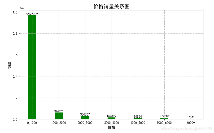
八 價格銷量
#!/usr/bin/env python
# -*- coding: utf-8 -*-
"""
__title__ = ''
__author__ = 'jia666666'
__time__ = '2020/3/24'
"""
import time
import matplotlib
import numpy as np
import seaborn as sns
import pandas as pd
import matplotlib.pyplot as plt

# 讀取數據
n = '../file/CSV/智慧手機'  + '-all.csv'
data = pd.read_csv(n)
data.fillna(value=0,inplace=True)
print(len(data['銷量']))
#data=list()

price_1000,price_2000,price_3000,price_4000,price_5000,price_6000,price_more =0,0,0,0,0,0,0

for i,sale in zip(data['價格'],data['銷量']):
    i=int(i)
    sale=int(sale)
    if i<1000:
        price_1000+=sale
    elif i<2000:
        #print(sale)
        price_2000+=sale
        #print(price_2000)
    elif i<3000:
        price_3000+=sale
    elif i<4000:
        price_4000+=sale
    elif i<5000:
        price_5000+=sale
    elif i<6000:
        price_6000+=sale
    else:
        price_more+=sale

print(price_2000)


#------------------------------------------------------------------------------
# 第二步:繪製柱狀圖
#------------------------------------------------------------------------------

import matplotlib.pyplot as plt

plt.rcParams['font.sans-serif'] = ['SimHei']  #用來正常顯示中文標籤
plt.rcParams['axes.unicode_minus'] = False    #用來正常顯示負號


nume=['0_1000','1000_2000','2000_3000','3000_4000','4000_5000','5000_6000','6000+']
sales=[price_1000,price_2000,price_3000,price_4000,price_5000,price_6000,price_more ]
# 繪圖
plt.figure(figsize=[10,6])
#plt.bar(names, nums, width=0.3, color='green')
plt.bar(nume,sales, width=0.3, color='green')

# 設定標題
plt.xlabel("價格", fontproperties='SimHei', size=12)
plt.ylabel("銷量", fontproperties='SimHei', rotation=90, size=12)
plt.title("價格銷量關係圖", fontproperties='SimHei', size=16)
#傾斜度角
plt.xticks(list(nume), fontproperties='SimHei', rotation=0, size=10)
# 顯示數位
for a, b in zip(list(nume), list(sales)):
    #x軸,y軸,顯示數值,水平居中,垂直底部,字型大小
    plt.text(a,b,b, ha='center', va='bottom', size=10)
plt.grid(linestyle='-.')
plt.savefig('../file/PNG/04價格銷量關係圖.png')
plt.show()
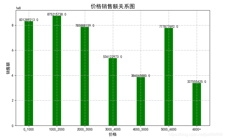
九 價格銷售額
#!/usr/bin/env python
# -*- coding: utf-8 -*-
"""
__title__ = ''
__author__ = 'jia666666'
__time__ = '2020/3/24'
"""
import time
import matplotlib
import numpy as np
import seaborn as sns
import pandas as pd
import matplotlib.pyplot as plt

# 讀取數據
n = '../file/CSV/智慧手機'  + '-all.csv'
data = pd.read_csv(n)
data.fillna(value=0,inplace=True)
print(len(data['銷量']))
#data=list()

price_1000,price_2000,price_3000,price_4000,price_5000,price_6000,price_more =0,0,0,0,0,0,0

for i,sale in zip(data['價格'],data['銷量']):
    i=int(i)
    sale=i*sale

    if i<1000:
        price_1000+=sale
    elif i<2000:
        #print(sale)
        price_2000+=sale
        #print(price_2000)
    elif i<3000:
        price_3000+=sale
    elif i<4000:
        price_4000+=sale
    elif i<5000:
        price_5000+=sale
    elif i<6000:
        price_6000+=sale
    else:
        price_more+=sale

print(price_2000)


#------------------------------------------------------------------------------
# 第二步:繪製柱狀圖
#------------------------------------------------------------------------------

import matplotlib.pyplot as plt

plt.rcParams['font.sans-serif'] = ['SimHei']  #用來正常顯示中文標籤
plt.rcParams['axes.unicode_minus'] = False    #用來正常顯示負號


nume=['0_1000','1000_2000','2000_3000','3000_4000','4000_5000','5000_6000','6000+']
sales=[price_1000,price_2000,price_3000,price_4000,price_5000,price_6000,price_more ]
# 繪圖
plt.figure(figsize=[10,6])
#plt.bar(names, nums, width=0.3, color='green')
plt.bar(nume,sales, width=0.3, color='green')

# 設定標題
plt.xlabel("價格", fontproperties='SimHei', size=12)
plt.ylabel("銷售額", fontproperties='SimHei', rotation=90, size=12)
plt.title("價格銷售額關係圖", fontproperties='SimHei', size=16)
#傾斜度角
plt.xticks(list(nume), fontproperties='SimHei', rotation=0, size=10)
# 顯示數位
for a, b in zip(list(nume), list(sales)):
    #x軸,y軸,顯示數值,水平居中,垂直底部,字型大小
    plt.text(a,b,b, ha='center', va='bottom', size=10)
plt.grid(linestyle='-.')
plt.savefig('../file/PNG/05價格銷售額關係圖.png')
plt.show()
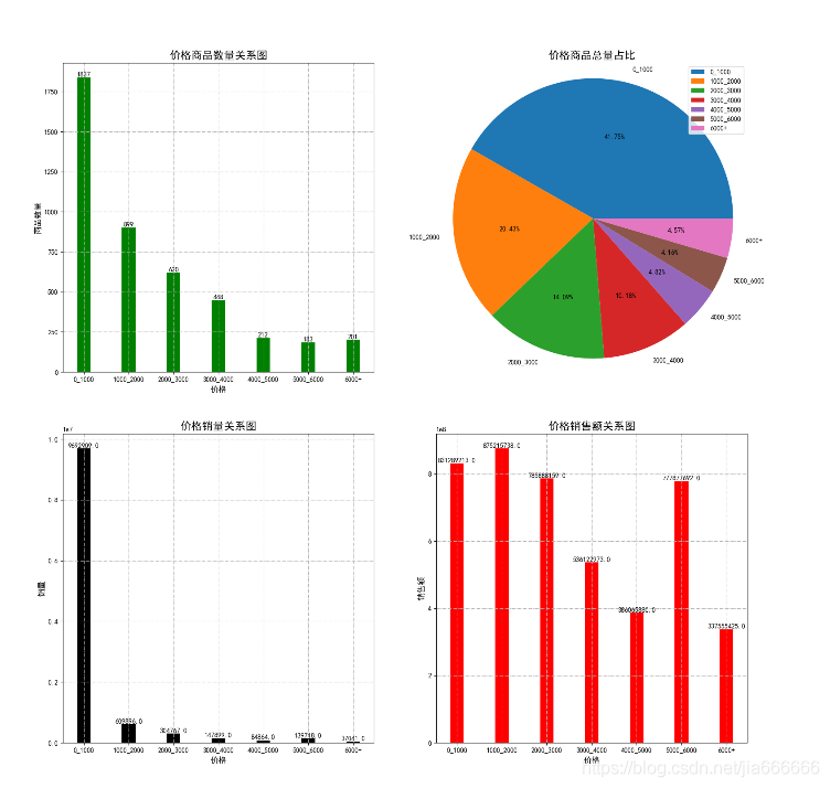
十 價格影響圖
#!/usr/bin/env python
# -*- coding: utf-8 -*-
"""
__title__ = ''
__author__ = 'jia666666'
__time__ = '2020/3/25'
"""
import time
import pandas as pd


# 讀取數據
n = '../file/CSV/智慧手機'  + '-all.csv'
data = pd.read_csv(n)
data.fillna(value=0,inplace=True)
#數據定義
count_1000,count_2000,count_3000,count_4000,count_5000,count_6000,count_more =0,0,0,0,0,0,0
sale_1000,sale_2000,sale_3000,sale_4000,sale_5000,sale_6000,sale_more =0,0,0,0,0,0,0
money_1000,money_2000,money_3000,money_4000,money_5000,money_6000,money_more =0,0,0,0,0,0,0
#數據處理
for i,j in zip(data['價格'],data['銷量']):
    i=int(i)
    #print(i)
    if i<1000:
        count_1000+=1
        sale_1000+=j
        money_1000+=i*j
    elif i<2000:
        count_2000 += 1
        sale_2000 += j
        money_2000 += i * j
    elif i<3000:
        count_3000 += 1
        sale_3000 += j
        money_3000 += i * j
    elif i<4000:
        count_4000 += 1
        sale_4000 += j
        money_4000 += i * j
    elif i<5000:
        count_5000 += 1
        sale_5000 += j
        money_5000 += i * j
    elif i<6000:
        count_6000 += 1
        sale_6000 += j
        money_6000 += i * j
    else:
        count_more += 1
        sale_more += j
        money_more += i * j
#print(count_2000)
#------------------------------------------------------------------------------
# 初始化
#------------------------------------------------------------------------------

import matplotlib.pyplot as plt

plt.figure(figsize=[18,18])
plt.rcParams['font.sans-serif'] = ['SimHei']  #用來正常顯示中文標籤
plt.rcParams['axes.unicode_minus'] = False    #用來正常顯示負號

#------------------------------------------------------------------------------
# 數據獲取
#------------------------------------------------------------------------------
index=['0_1000','1000_2000','2000_3000','3000_4000','4000_5000','5000_6000','6000+']
count=[count_1000,count_2000,count_3000,count_4000,count_5000,count_6000,count_more ]
sale=[sale_1000,sale_2000,sale_3000,sale_4000,sale_5000,sale_6000,sale_more]
money=[money_1000,money_2000,money_3000,money_4000,money_5000,money_6000,money_more]


#------------------------------------------------------------------------------
# p1價格商品關係條形圖
#------------------------------------------------------------------------------
p1=plt.subplot(221)
plt.bar(index,count, width=0.3, color='green')
# 設定標題
plt.xlabel("價格", fontproperties='SimHei', size=12)
plt.ylabel("商品數量", fontproperties='SimHei', rotation=90, size=12)
plt.title("價格商品數量關係圖", fontproperties='SimHei', size=16)
#傾斜度角
plt.xticks(list(index), fontproperties='SimHei', rotation=0, size=10)
# 顯示數位
for a, b in zip(list(index), list(count)):
    #x軸,y軸,顯示數值,水平居中,垂直底部,字型大小
    plt.text(a,b,b, ha='center', va='bottom', size=10)
plt.grid(linestyle='-.')
plt.sca(p1)
#------------------------------------------------------------------------------
# 價格商品數量餅圖
#------------------------------------------------------------------------------
p2=plt.subplot(222)

plt.pie(count,labels=index,autopct='%.2f%%')
plt.title("價格商品總量佔比", fontproperties='SimHei', size=16)
plt.axis('equal')
plt.legend()
plt.sca(p2)
#------------------------------------------------------------------------------
# 價格銷量關係
#------------------------------------------------------------------------------
p3=plt.subplot(223)
plt.bar(index,sale, width=0.3, color='black')

# 設定標題
plt.xlabel("價格", fontproperties='SimHei', size=12)
plt.ylabel("銷量", fontproperties='SimHei', rotation=90, size=12)
plt.title("價格銷量關係圖", fontproperties='SimHei', size=16)
#傾斜度角
plt.xticks(list(index), fontproperties='SimHei', rotation=0, size=10)

plt.grid(linestyle='-.')
# 顯示數位
for a, b in zip(list(index), list(sale)):
    #x軸,y軸,顯示數值,水平居中,垂直底部,字型大小
    plt.text(a,b,b, ha='center', va='bottom', size=10)
plt.sca(p3)


#------------------------------------------------------------------------------
# 價格銷售額
#------------------------------------------------------------------------------
p4=plt.subplot(224)
plt.bar(index,money, width=0.3, color='red')

# 設定標題
plt.xlabel("價格", fontproperties='SimHei', size=12)
plt.ylabel("銷售額", fontproperties='SimHei', rotation=90, size=12)
plt.title("價格銷售額關係圖", fontproperties='SimHei', size=16)
#傾斜度角
plt.xticks(list(index), fontproperties='SimHei', rotation=0, size=10)
# 顯示數位
for a, b in zip(list(index), list(money)):
    #x軸,y軸,顯示數值,水平居中,垂直底部,字型大小
    plt.text(a,b,b, ha='center', va='bottom', size=10)
plt.sca(p4)

#------------------------------------------------------------------------------
# 數據顯示
#------------------------------------------------------------------------------
plt.grid(linestyle='-.')
plt.savefig('../file/PNG/06價格影響關係圖.png')
plt.show()
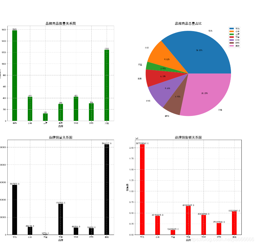
十一 品牌影響關係圖
#!/usr/bin/env python
# -*- coding: utf-8 -*-
"""
__title__ = ''
__author__ = 'jia666666'
__time__ = '2020/3/25'
"""

import time
import pandas as pd


# 讀取數據
n = '../file/CSV/智慧手機'  + '-all.csv'
data = pd.read_csv(n)
data.fillna(value=0,inplace=True)
#數據定義
count_1000,count_2000,count_3000,count_4000,count_5000,count_6000,count_more =0,0,0,0,0,0,0
sale_1000,sale_2000,sale_3000,sale_4000,sale_5000,sale_6000,sale_more =0,0,0,0,0,0,0
money_1000,money_2000,money_3000,money_4000,money_5000,money_6000,money_more =0,0,0,0,0,0,0
#數據處理
for item,i,j in zip(data['商品名'],data['價格'],data['銷量']):
    i=int(i)
    #print(i)
    if '華爲' in item:
        count_1000+=1
        sale_1000+=j
        money_1000+=i*j
    elif '小米' in item:
        count_2000 += 1
        sale_2000 += j
        money_2000 += i * j
    elif '三星' in item:
        count_3000 += 1
        sale_3000 += j
        money_3000 += i * j
    elif '蘋果' in item:
        count_4000 += 1
        sale_4000 += j
        money_4000 += i * j
    elif 'vivo' in item or 'VIVO' in item :
        count_5000 += 1
        sale_5000 += j
        money_5000 += i * j
    elif 'oppo' in item or 'OPPO' in item:
        count_6000 += 1
        sale_6000 += j
        money_6000 += i * j
    else:
        count_more += 1
        sale_more += j
        money_more += i * j
#print(count_2000)
#------------------------------------------------------------------------------
# 初始化
#------------------------------------------------------------------------------

import matplotlib.pyplot as plt

plt.figure(figsize=[20,18])
plt.rcParams['font.sans-serif'] = ['SimHei']  #用來正常顯示中文標籤
plt.rcParams['axes.unicode_minus'] = False    #用來正常顯示負號

#------------------------------------------------------------------------------
# 數據獲取
#------------------------------------------------------------------------------
index=['華爲','小米','三星','蘋果','VIVO','OPPO','其他']
count=[count_1000,count_2000,count_3000,count_4000,count_5000,count_6000,count_more ]
sale=[sale_1000,sale_2000,sale_3000,sale_4000,sale_5000,sale_6000,sale_more]
money=[money_1000,money_2000,money_3000,money_4000,money_5000,money_6000,money_more]


#------------------------------------------------------------------------------
# p1價格商品關係條形圖
#------------------------------------------------------------------------------
p1=plt.subplot(221)
plt.bar(index,count, width=0.3, color='green')
# 設定標題
plt.xlabel("品牌", fontproperties='SimHei', size=12)
plt.ylabel("商品數量", fontproperties='SimHei', rotation=90, size=12)
plt.title("品牌商品數量關係圖", fontproperties='SimHei', size=16)
#傾斜度角
plt.xticks(list(index), fontproperties='SimHei', rotation=0, size=10)
# 顯示數位
for a, b in zip(list(index), list(count)):
    #x軸,y軸,顯示數值,水平居中,垂直底部,字型大小
    plt.text(a,b,b, ha='center', va='bottom', size=10)
plt.grid(linestyle='-.')
plt.sca(p1)
#------------------------------------------------------------------------------
# 品牌商品數量餅圖
#------------------------------------------------------------------------------
p2=plt.subplot(222)

plt.pie(count,labels=index,autopct='%.2f%%')
plt.title("品牌商品總量佔比", fontproperties='SimHei', size=16)
plt.axis('equal')
plt.legend()
plt.sca(p2)
#------------------------------------------------------------------------------
# 品牌銷量關係
#------------------------------------------------------------------------------
p3=plt.subplot(223)
plt.bar(index,sale, width=0.3, color='black')

# 設定標題
plt.xlabel("品牌", fontproperties='SimHei', size=12)
plt.ylabel("銷量", fontproperties='SimHei', rotation=90, size=12)
plt.title("品牌銷量關係圖", fontproperties='SimHei', size=16)
#傾斜度角
plt.xticks(list(index), fontproperties='SimHei', rotation=0, size=10)
# 顯示數位
for a, b in zip(list(index), list(sale)):
    #x軸,y軸,顯示數值,水平居中,垂直底部,字型大小
    plt.text(a,b,b, ha='center', va='bottom', size=10)
plt.grid(linestyle='-.')
plt.sca(p3)


#------------------------------------------------------------------------------
# 品牌銷售額
#------------------------------------------------------------------------------
p4=plt.subplot(224)
plt.bar(index,money, width=0.3, color='red')

# 設定標題
plt.xlabel("品牌", fontproperties='SimHei', size=12)
plt.ylabel("銷售額", fontproperties='SimHei', rotation=90, size=12)
plt.title("品牌銷售額關係圖", fontproperties='SimHei', size=16)
#傾斜度角
plt.xticks(list(index), fontproperties='SimHei', rotation=0, size=10)
# 顯示數位
for a, b in zip(list(index), list(money)):
    #x軸,y軸,顯示數值,水平居中,垂直底部,字型大小
    plt.text(a,b,b, ha='center', va='bottom', size=10)
plt.grid(linestyle='-.')
plt.sca(p4)

#------------------------------------------------------------------------------
# 數據顯示
#------------------------------------------------------------------------------


plt.savefig('../file/PNG/12品牌影響關係圖.png')
plt.show()