3.Matplotlib設定圖例與顏色條
文章目錄
Matplotlib設定圖例與顏色條
前面講解過,如何給影象增加圖例,可以統一給plt.legend()傳入名稱陣列,也可以在每個圖線中指定label屬性
但是這兩種方式都僅僅是簡單的爲圖片新增圖例,我們這一節將講解如何對圖例進行高級別的設定
顏色條也是同樣,之前只是顯示出顏色條,這一節將會講解如何對顏色條進行設定
設定圖例
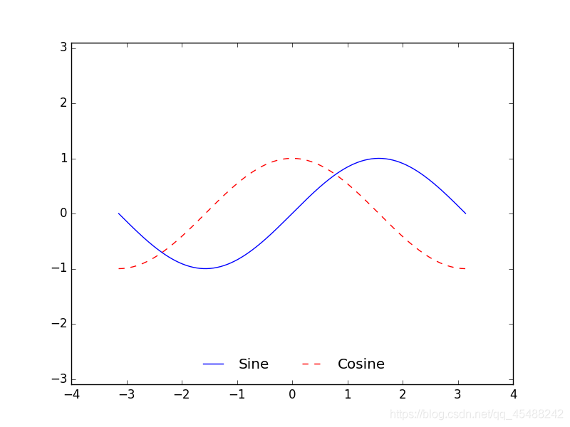
預設情況下的圖例
我們首先建立一個最簡單的圖例
x=np.linspace(start=-np.pi,stop=np.pi,num=300)

plt.style.use('classic')
Fig,Axes=plt.subplots(1)
Axes.plot(x,np.sin(x),'-b',label='Sine')
Axes.plot(x,np.cos(x),'--r',label='Cosine')

Axes.axis('equal')
Axes.legend()

plt.show()
可以看到,預設情況下圖例是新增在影象的右上角
圖例外觀設定
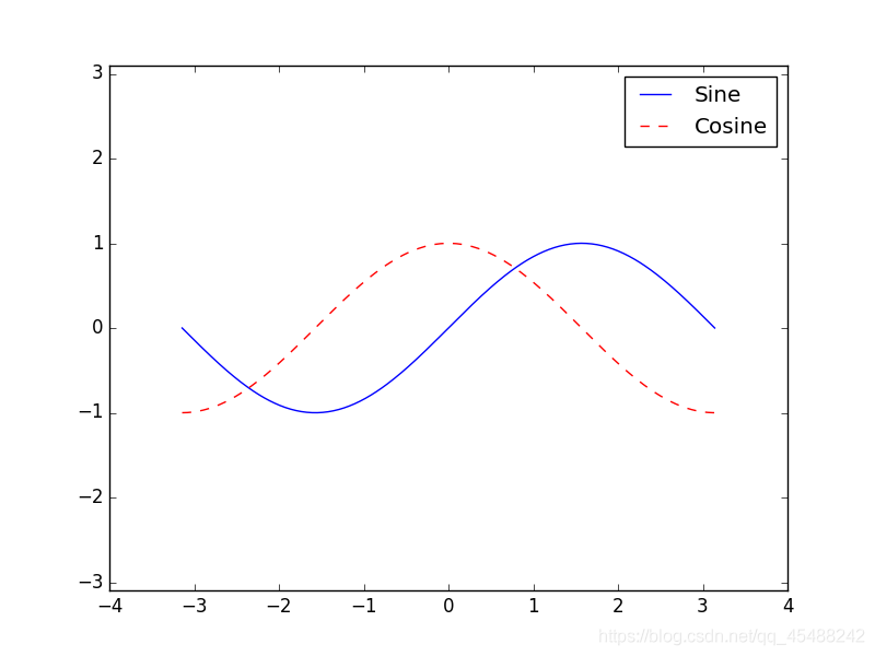
指定loc參數設定圖例位置
我們可以指定loc參數來設定圖例的位置
x=np.linspace(start=-np.pi,stop=np.pi,num=300)

plt.style.use('classic')
Fig,Axes=plt.subplots(1)
Axes.plot(x,np.sin(x),'-b',label='Sine')
Axes.plot(x,np.cos(x),'--r',label='Cosine')

Axes.axis('equal')
Axes.legend(loc='upper left')

plt.show()
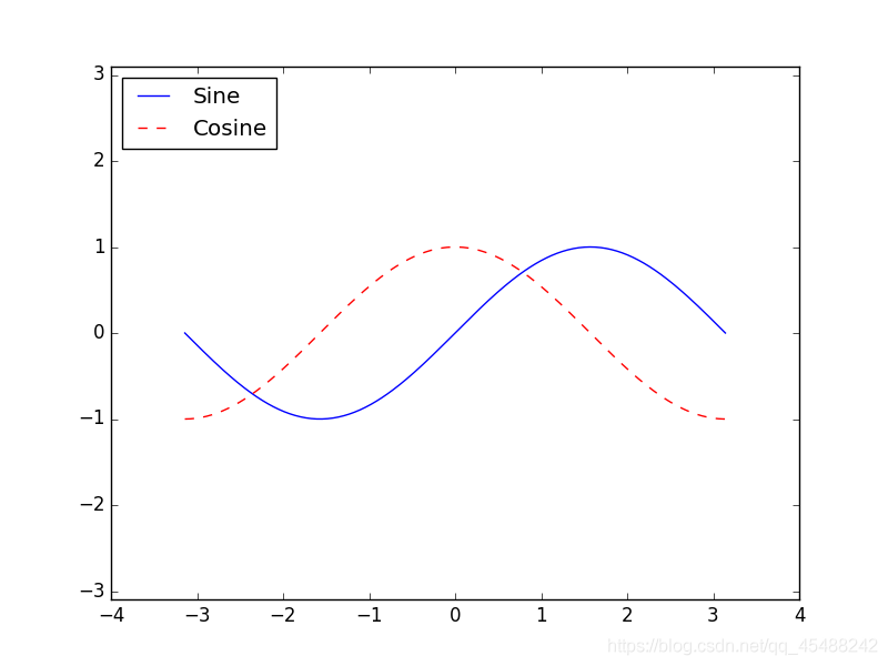
指定frameon參數來設定邊框
預設情況下圖例的邊框是開啓的,我們可以指定frameon參數來取消邊框
x=np.linspace(start=-np.pi,stop=np.pi,num=300)

plt.style.use('classic')
Fig,Axes=plt.subplots(1)
Axes.plot(x,np.sin(x),'-b',label='Sine')
Axes.plot(x,np.cos(x),'--r',label='Cosine')

Axes.axis('equal')
Axes.legend(loc='lower center',frameon=False)

plt.show()
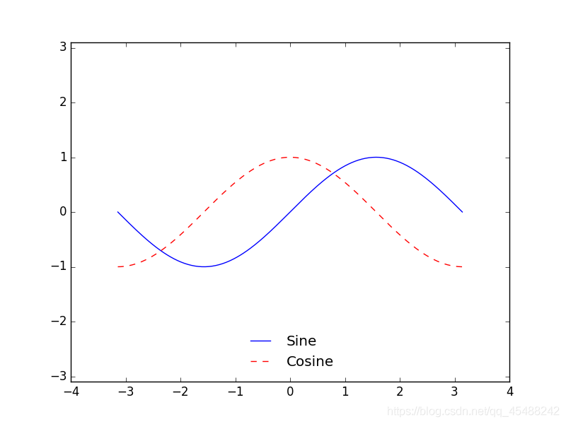
指定ncol參數來設定標籤列數
我們可以使用ncol參數來設定標籤的列數
x=np.linspace(start=-np.pi,stop=np.pi,num=300)

plt.style.use('classic')
Fig,Axes=plt.subplots(1)
Axes.plot(x,np.sin(x),'-b',label='Sine')
Axes.plot(x,np.cos(x),'--r',label='Cosine')

Axes.axis('equal')
Axes.legend(loc='lower center',frameon=False,ncol=2)

plt.show()
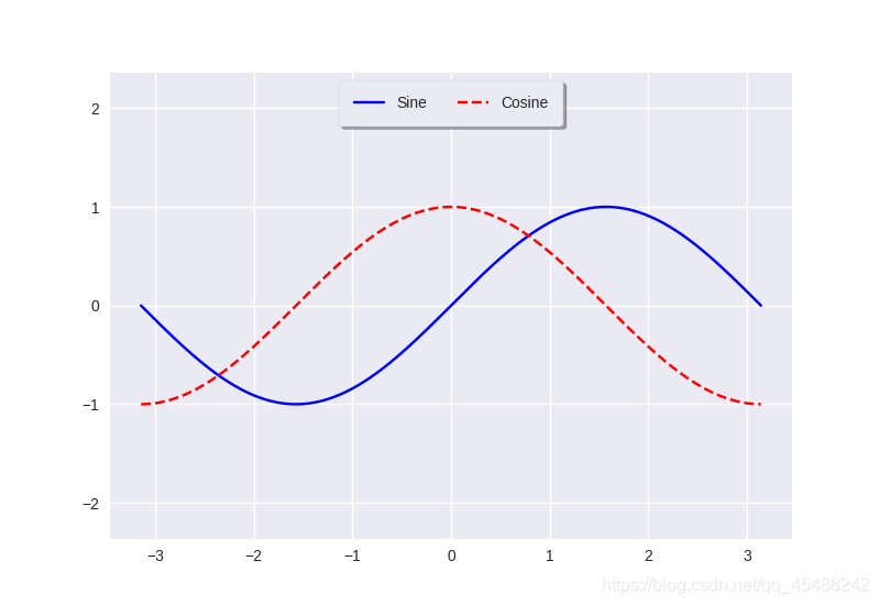
指定圓角邊框,增加邊框陰影與改變邊框透明度
我們分別可以指定fancybox來指定圓角邊框,設定shadow參數爲True新增陰影,設定framealpha來設定邊框透明度,設定borderpad來設定文字舉例邊框距離
x=np.linspace(start=-np.pi,stop=np.pi,num=300)

plt.style.use('seaborn')
Fig,Axes=plt.subplots(1)
Axes.plot(x,np.sin(x),'-b',label='Sine')
Axes.plot(x,np.cos(x),'--r',label='Cosine')

Axes.axis('equal')
Axes.legend(loc='upper center',frameon=True,ncol=2,framealpha=1,fancybox=True,shadow=True,borderpad=1)

plt.show()
選擇圖例現實的元素
在預設狀態下,圖例會顯示所有元素的標籤,如果我們不想顯示其中的全部,我們可以通過一些圖形命令來指定顯示圖例中哪些元素和標籤
我們有兩種方法來指定圖例將會顯示的元素,第一種是將需要顯示的線條傳入plt.legend,第二種是爲需要顯示圖例的線條設定label參數
爲plt.legend()傳入需要顯示的線條
我們爲plt.plot()可以傳入一個多維陣列和一維陣列,這樣plt.plot會自動的以一維陣列作爲x座標值,多維陣列的每列作爲y座標值進行繪圖
而且plt.plot()實際上在繪完圖線之後會返回元素爲plt.Line2D物件的列表
x=np.linspace(start=-np.pi,stop=np.pi,num=300)
plot=plt.plot(x,np.sin(x))
print(type(plot[0]))
>>>
<class 'matplotlib.lines.Line2D'>
所以我們實際上對線條的樣式不僅可以通過plt.plot()在繪圖時候指定,其實也可以呼叫plt.Line2D物件的方法來進行修改
不過這裏只講解顯示指定的元素.所以我們實際上可以繪製多條線,得到一個包含所有線的plt.Line2D物件的列表,接下來將需要顯示圖例的線條傳入plt.legend即可
x=np.linspace(start=-np.pi,stop=np.pi,num=300)
y=np.sin(x[:,np.newaxis]+np.pi*np.arange(start=0,stop=2,step=0.5))            #注意這裏發生了廣播所以y是一個高維陣列


lines=plt.plot(x,y)
plt.legend(lines[:2],['first','second'])
plt.show()
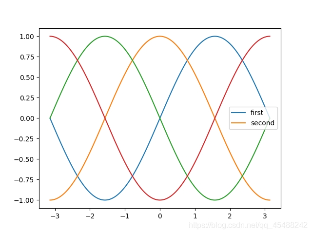
這裏我們一共生成了四條線,表現在影象上依次向左平移(左加右減),我們爲前兩條線,分別是藍線和藍線向左平移一個單位得到的橙線新增圖例
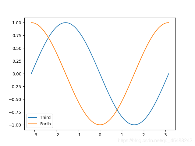
爲需要顯示的線設定label參數
plt.plot(x,y[:,2],label='Third')
plt.plot(x,y[:,3],label='Forth')
plt.legend()
plt.show()
在圖例中顯示不同尺寸的點
下面 下麪我們將以加利福尼亞州所有城市的數據(提取碼666)爲例來繪圖,最終效果是將繪製出各個城市的位置,同時以城市面積大小來使用不同大小的圓表示
cities=pd.read_csv('california_cities.csv')


latitude,longitude=cities['latd'],cities['longd']
population,area=cities['population_total'],cities['area_total_km2']


plt.scatter(latitude,longitude,label=None,c=np.log10(population),cmap='viridis',s=area,linewidths=0,alpha=0.5)
plt.axis(aspect='euqal')a
plt.xlabel('Logitude')
plt.ylabel('Latitude')
plt.colorbar(label='log_{10}$(population)')
plt.clim(3,7)

for area in [100,300,500]:
    plt.scatter([],[],c='k',alpha=0.3,s=area,label=str(area)+' km$^2$')

plt.legend(scatterpoints=1,frameon=False,labelspacing=1,title='City Area')
plt.title('California Cities : Area and Population')
plt.show()
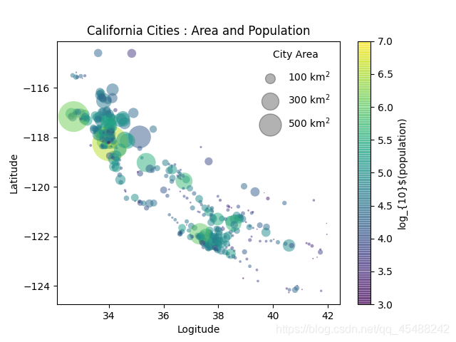
注意,這裏我們實際上一共使用了四次plt.scatter()函數,其中只有第一次實際上繪製了圖片裡的所有的點,而剩下的三個plt.scatter()函數實際上都是在回圈中使用的.後面的三次plt.scatter()函數實際上都沒有繪圖,而是用於新增圖例
label參數實際上會以當前繪製圖像中的點爲例,然後附加上我們給label參數的說明.而前面的列表只是告訴Matplotlib我們該在哪些地方畫點,所以即便我們傳入兩個空列表(表示不再任何地方畫點),也不會影響我們圖例中的影象的顯示
也正是因爲label會以影象中的點爲例,因此我們只要控制點的大小和顏色就能分別繪製圖例中的三個元素
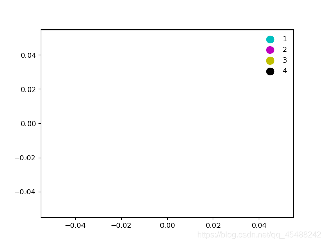
所以根據以上講解,我們可以這樣建立一個圖例
La=1
for color in list('cmyk'):
    plt.scatter([],[],c=color,s=100,label=La)
    La+=1
plt.legend(frameon=False)
plt.show()
同時顯示多個圖例
有的時候,由於排版問題,我們可能需要在同一張影象上顯示多個圖例.但是用Matplotlib來解決這個問題其實並不容易,因爲標準的legend介面只支援爲一張影象建立一個圖例.如果我們使用legend介面再建立第二個,那麼第一個圖例就會被覆蓋
Matplotlib中我們解決這個問題就是建立一個圖例藝術家物件,然後呼叫底層的ax.add_artist()方法來爲圖片新增第二個圖例
Fig,Axes=plt.subplots(1)

lines=[]
style=['-','--','-.',':']
x=np.linspace(start=-np.pi,stop=np.pi,num=500)

for i in range(4):
    lines+= Axes.plot(x,np.sin(x-i*np.pi/2),style[i],color='black')

Axes.axis('equal')

Axes.legend(lines[:2],['Line A','Line B'],loc='uppper right',frameon=False)
from matplotlib.legend import Legend
Leg=Legend(Axes,lines[2:],['Line C','Line D'],loc='lower right',frameon=False)
Axes.add_artist(Leg)

plt.show()
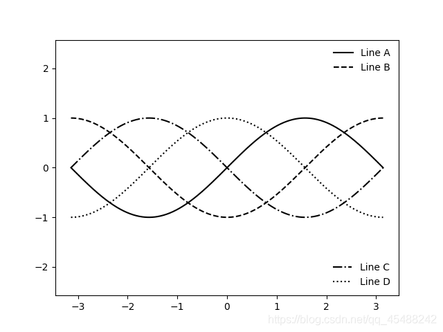
這裏第12行,我們首先使用正常的方法建立了第一個圖例,接下來我們從matplotlib的legend庫中匯入了Legend物件,我們範例化一個Legend物件之後,呼叫Axes物件的add_artist底層方法來新增圖例
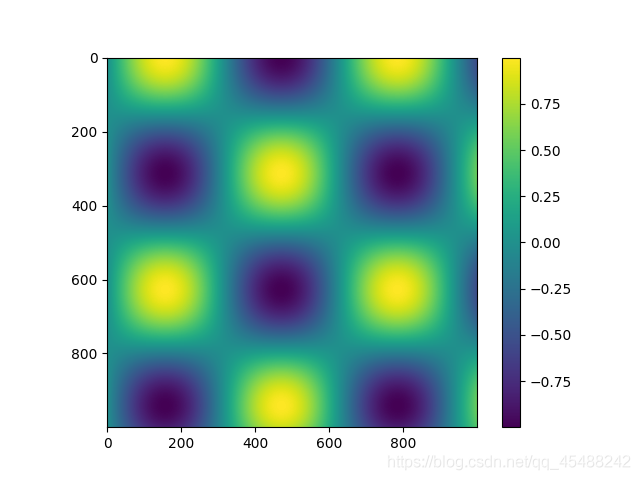
設定顏色條
圖例是通過離散的標籤值來表示離散的圖形元素的含義的物件.但是對於由色彩來表示不同含義的點,線,面構成的連續座標或影象,用顏色條來表示的效果比較好.
在Matplotlib中,顏色條是一個獨立的座標軸,可以用以指明圖形中顏色的含義
預設情況下的顏色條
我們直接使用plt.colorbar()調出的就是預設情況下的顏色條
x=np.linspace(start=0,stop=10,num=1000)
Z=np.sin(x)*np.cos(x[:,np.newaxis])

plt.imshow(Z)
plt.colorbar()
plt.show()
設定顏色條的配色方案
設定顏色條的配色方案,實際上就是對影象的顏色進行設定,即指定繪圖函數中的cmap參數來指定顏色條的配色方案
所有的配色方案
所有的配色方案如下
‘Accent’, ‘Accent_r’, ‘Blues’, ‘Blues_r’, ‘BrBG’, ‘BrBG_r’, ‘BuGn’, ‘BuGn_r’, ‘BuPu’, ‘BuPu_r’, ‘CMRmap’, ‘CMRmap_r’, ‘Dark2’, ‘Dark2_r’, ‘GnBu’, ‘GnBu_r’, ‘Greens’, ‘Greens_r’, ‘Greys’, ‘Greys_r’, ‘OrRd’, ‘OrRd_r’, ‘Oranges’, ‘Oranges_r’, ‘PRGn’, ‘PRGn_r’, ‘Paired’, ‘Paired_r’, ‘Pastel1’, ‘Pastel1_r’, ‘Pastel2’, ‘Pastel2_r’, ‘PiYG’, ‘PiYG_r’, ‘PuBu’, ‘PuBuGn’, ‘PuBuGn_r’, ‘PuBu_r’, ‘PuOr’, ‘PuOr_r’, ‘PuRd’, ‘PuRd_r’, ‘Purples’, ‘Purples_r’, ‘RdBu’, ‘RdBu_r’, ‘RdGy’, ‘RdGy_r’, ‘RdPu’, ‘RdPu_r’, ‘RdYlBu’, ‘RdYlBu_r’, ‘RdYlGn’, ‘RdYlGn_r’, ‘Reds’, ‘Reds_r’, ‘Set1’, ‘Set1_r’, ‘Set2’, ‘Set2_r’, ‘Set3’, ‘Set3_r’, ‘Spectral’, ‘Spectral_r’, ‘Wistia’, ‘Wistia_r’, ‘YlGn’, ‘YlGnBu’, ‘YlGnBu_r’, ‘YlGn_r’, ‘YlOrBr’, ‘YlOrBr_r’, ‘YlOrRd’, ‘YlOrRd_r’, ‘afmhot’, ‘afmhot_r’, ‘autumn’, ‘autumn_r’, ‘binary’, ‘binary_r’, ‘bone’, ‘bone_r’, ‘brg’, ‘brg_r’, ‘bwr’, ‘bwr_r’, ‘cividis’, ‘cividis_r’, ‘cool’, ‘cool_r’, ‘coolwarm’, ‘coolwarm_r’, ‘copper’, ‘copper_r’, ‘cubehelix’, ‘cubehelix_r’, ‘flag’, ‘flag_r’, ‘gist_earth’, ‘gist_earth_r’, ‘gist_gray’, ‘gist_gray_r’, ‘gist_heat’, ‘gist_heat_r’, ‘gist_ncar’, ‘gist_ncar_r’, ‘gist_rainbow’, ‘gist_rainbow_r’, ‘gist_stern’, ‘gist_stern_r’, ‘gist_yarg’, ‘gist_yarg_r’, ‘gnuplot’, ‘gnuplot2’, ‘gnuplot2_r’, ‘gnuplot_r’, ‘gray’, ‘gray_r’, ‘hot’, ‘hot_r’, ‘hsv’, ‘hsv_r’, ‘inferno’, ‘inferno_r’, ‘jet’, ‘jet_r’, ‘magma’, ‘magma_r’, ‘nipy_spectral’, ‘nipy_spectral_r’, ‘ocean’, ‘ocean_r’, ‘pink’, ‘pink_r’, ‘plasma’, ‘plasma_r’, ‘prism’, ‘prism_r’, ‘rainbow’, ‘rainbow_r’, ‘seismic’, ‘seismic_r’, ‘spring’, ‘spring_r’, ‘summer’, ‘summer_r’, ‘tab10’, ‘tab10_r’, ‘tab20’, ‘tab20_r’, ‘tab20b’, ‘tab20b_r’, ‘tab20c’, ‘tab20c_r’, ‘terrain’, ‘terrain_r’, ‘twilight’, ‘twilight_r’, ‘twilight_shifted’, ‘twilight_shifted_r’, ‘viridis’, ‘viridis_r’, ‘winter’, ‘winter_r’
他們都位於plt.cm的名稱空間中
確定需要的配色方案
實際上關於配色方案的選擇並不在如何使用工具的講解中出現,這裏只是簡單的講下
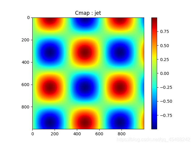
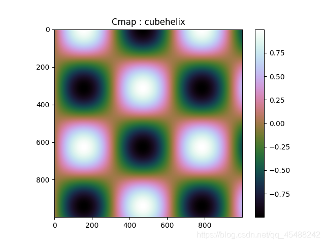
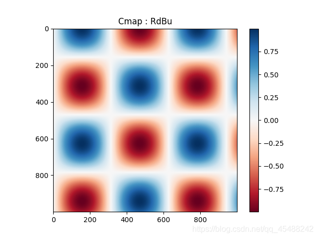
根據我們需要配色的物件的數值不同,我們通常只重點關注三種不同的配色方案
- 順序配色方案:由一組連續的顏色構成的配色方案,例如:binary或viridis
- 互逆配色方案:通常由梁總互補的顏色構成,表示正反兩種含義.例如:RdGy或PuOr
- 定性配色方案:隨機順序的一組顏色,只需要區別圖中的每個元素,例如:rainbow或jet
下面 下麪我們將看看每種配色方案的效果

更多的顏色設定,自己一一嘗試即可
設定顏色條的範圍
我們可以使用plt.clim來設定顏色條的刻度範圍,同時我們也能夠指定plt.colorbar()的extend參數來指定是否使用上下箭頭來表示超出範圍的值
plt.figure(figsize=(10,3.5))

x=np.linspace(start=0,stop=10,num=1000)
Z=np.sin(x)*np.cos(x[:,np.newaxis])

plt.subplot(1,2,1)
plt.imshow(Z,cmap='RdBu')
plt.colorbar()

plt.subplot(1,2,2)
plt.imshow(Z,cmap='RdBu')
plt.colorbar(extend='both')
plt.clim(-1,1)

plt.show()
![[外链图片转存失败,源站可能有防盗链机制,建议将图片保存下来直接上传(img-B8OqIAzN-1596865634954)(图片/Figure_50.png)]](https://s3.ap-northeast-1.wasabisys.com/img.tw511.com/202008/20200808135230920qd5lgnzhghv.png)
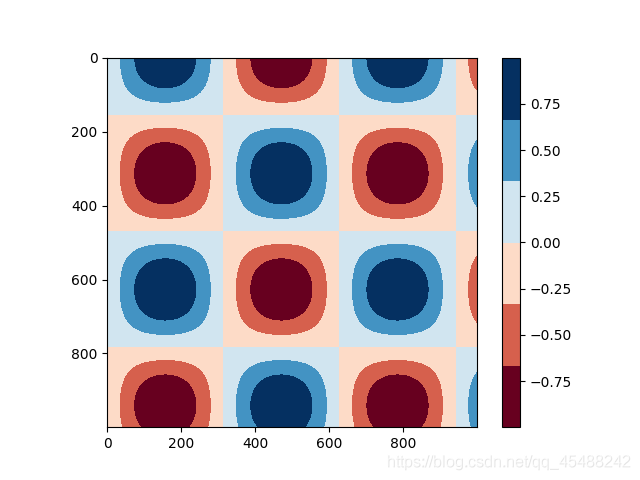
設定離散的顏色條
雖然預設所有顏色調都是連續的,但是有的時候我們可能需要使用顏色條來表示離散值,爲此,我們可以使用離散的顏色條
最簡單的做法就是使用plt.cm.get_cmap()函數,將配色方案和需要離散的區間格式傳入進去即可
x=np.linspace(start=0,stop=10,num=1000)
Z=np.sin(x)*np.cos(x[:,np.newaxis])

plt.imshow(Z,cmap=plt.cm.get_cmap('RdBu',6))
plt.colorbar()
plt.show()